Brand Study 03
The Architecture
of Adrenaline
Brand
Red Bull
Industry
Energy & Lifestyle
Focus
Motion Systems, Cultural Ownership, Brand Elasticity
Year
2025
Why This Brand
Red Bull doesn't sell energy drinks. It sells the permission to be reckless.
Every brand claims to understand its audience. Red Bull is one of the few that actually lives inside them. They don't sponsor athletes—they become the narrative infrastructure around which athletic mythology is built.
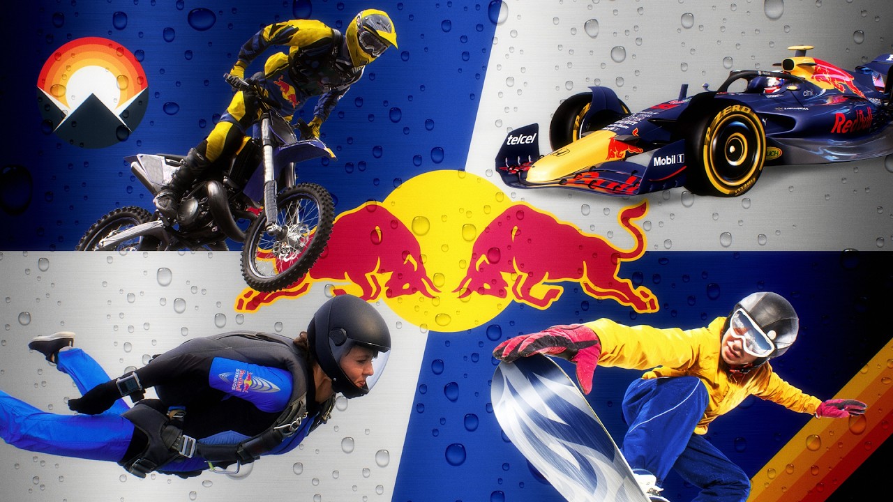
We studied Red Bull because they solved the hardest problem in branding: how do you contain cliff diving and classical music, F1 and freestyle skiing, all under one visual roof—without looking like a mood board collage?
What We Observed
The answer isn't visual consistency. It's kinetic consistency.
Red Bull's typography feels like velocity itself—headlines that slice across the viewport at aggressive angles, body text that snaps into place with mechanical precision. Their colour palette is reduced to four tones: midnight navy, signal red, titanium silver, and void black. But the magic isn't in the colours—it's in the motion.
We studied the biomechanics of extreme sports in their content. The way a skateboarder's body rotates in a kickflip. The arc of a cliff diver entering water. These organic curves appear as easing functions in their motion design. Nothing moves linearly—everything accelerates, peaks, and decelerates like a human body in flight.
The result is a system where a classical music event poster and an F1 race recap feel like they come from the same universe—not because they look the same, but because they move the same way. Rhythm is the brand constant, not colour.
Key Takeaways
What Red Bull teaches about becoming a media company in disguise.
Motion is a brand element. Most brand guidelines define colours, fonts, and spacing. Red Bull defines how things move. That's why their content feels alive across formats.
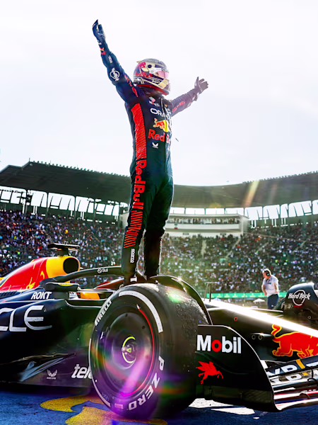
Own the culture, not the product. Red Bull spends more on content creation than on product advertising. The drink is the entry fee to a universe of experiences.
Elasticity requires a core. The brand stretches across 47 distinct sports and cultural domains without snapping because its core identity is emotional, not visual.
"Red Bull proved that the most powerful brand identity isn't a typeface or a colour. It's a heartbeat—a rhythm that your audience recognises before they see the logo."
— Our observation