Brand Study 05
From Bean
to Belief
Brand
Blue Tokai Coffee Roasters
Industry
Specialty Coffee
Focus
Provenance Design, Packaging Language, Cultural Positioning
Year
2025
Why This Brand
Coffee is not a commodity. It is a conversation between soil and sky, farmer and roaster, cup and consciousness.
Blue Tokai started a quiet revolution. In a country addicted to instant coffee and sugar-laden chai, they asked a dangerous question: what if Indians actually tasted their coffee? What if they knew the name of the estate, the altitude, the exact roast date?
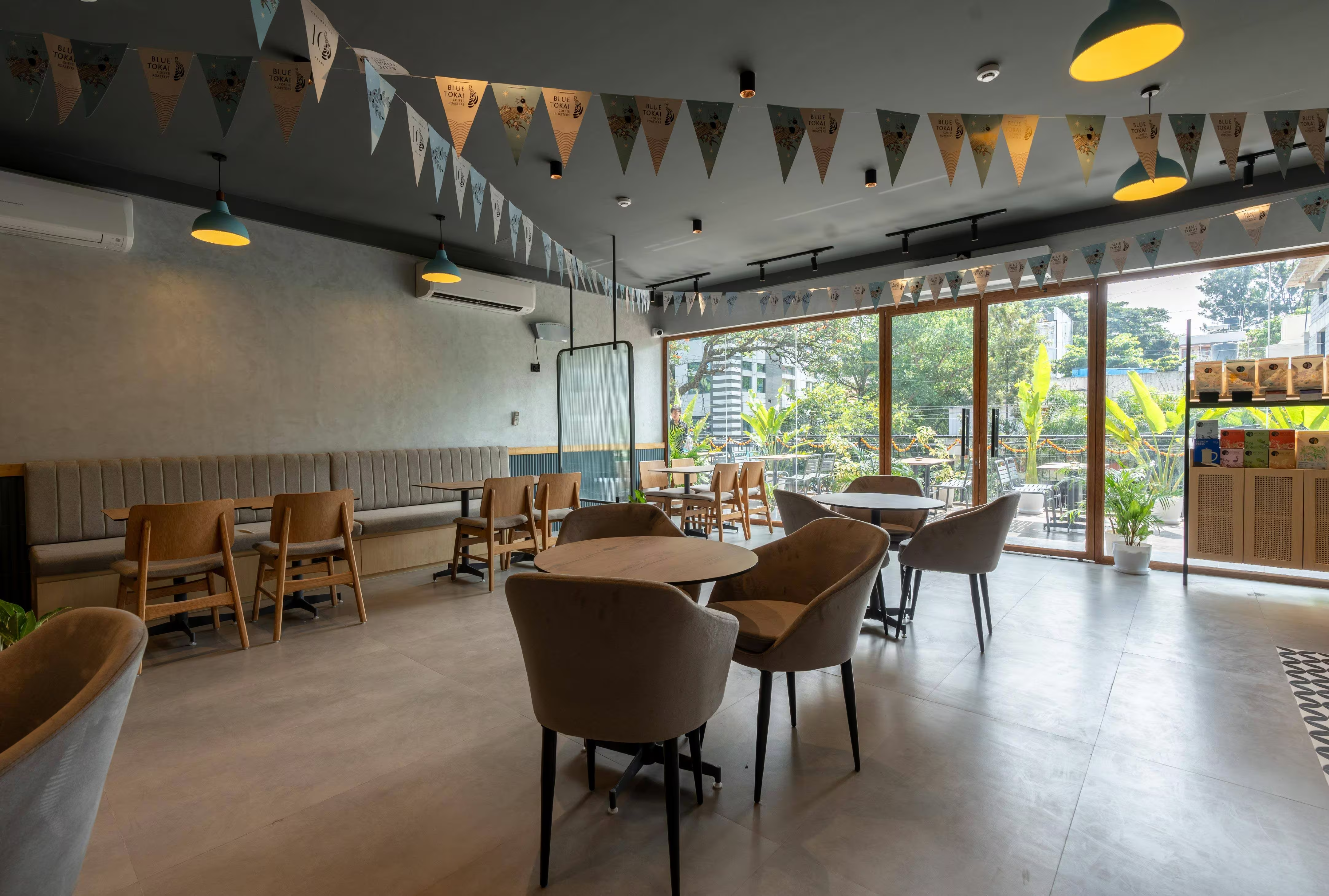
We're fascinated by how they evolved from "specialty coffee startup" to "India's defining coffee culture institution"—without losing the warmth that made their first café in Champa Gali feel like a friend's kitchen.
What We Observed
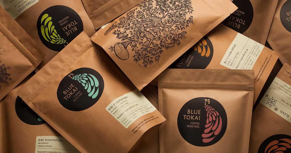
Blue Tokai's colour palette isn't designed. It's harvested.
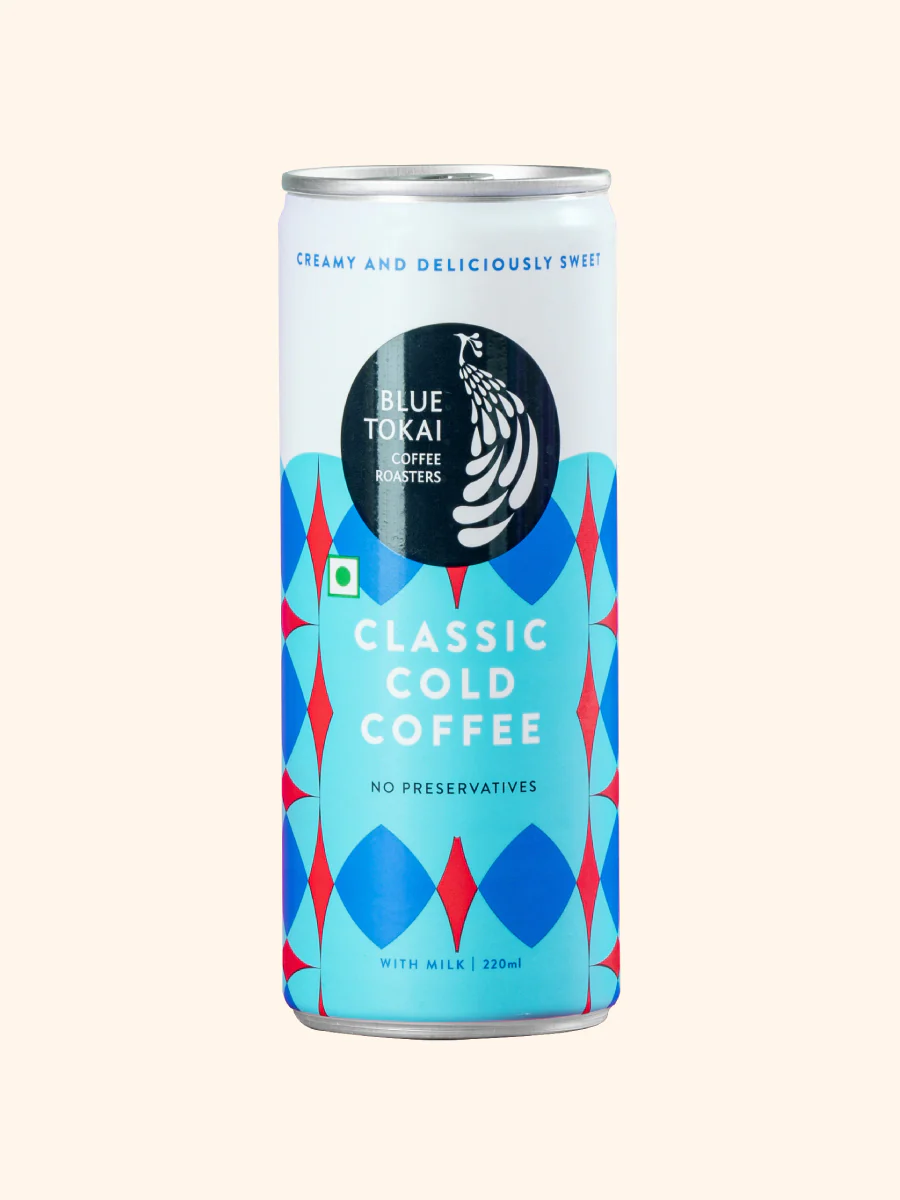
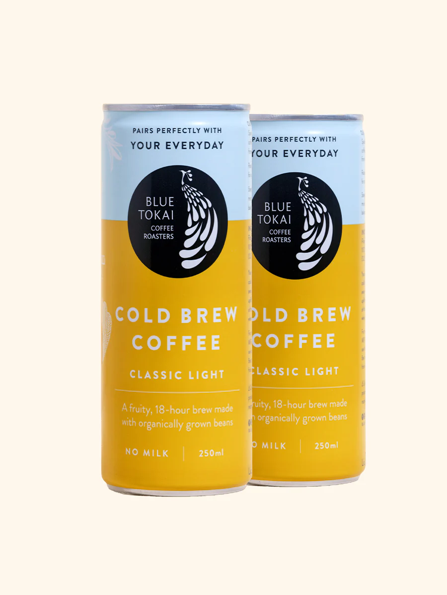
Their colours are pulled directly from the roasting spectrum—green bean to light roast to French roast. Each product tier has its own tonal register. Single-origins live in warm terracottas and deep ochres. Blends occupy cooler taupes and slate greys. Cold brew uses indigo—because cold brew is Blue Tokai's rebellion against its own orthodoxy.
The packaging tells the story of provenance. Every bag carries GPS coordinates of the estate, an elevation marker, a roast date, and a flavour wheel. It's not marketing. It's a love letter from the roaster to whoever is about to brew that cup at 6 AM on a Tuesday in Gurgaon.
What moves us most is how the brand's digital presence mirrors the physical ritual of coffee preparation. Pages load with deliberate pacing. Product photography uses natural light that shifts with the time of day. Nothing feels rushed—because good coffee, like good design, cannot be hurried.
Key Takeaways
What Blue Tokai teaches about building belief through transparency.
Provenance is a design element. GPS coordinates, elevation markers, and roast dates aren't data—they're storytelling. Every number on the bag builds trust and creates a ritual of reading.
Colour can be sourced, not chosen. Drawing your palette from the product's own material reality creates a coherence that no colour theory exercise can replicate.
Warmth scales. Blue Tokai went from one café to national presence without feeling corporate. The secret is that warmth was never an aesthetic—it was a value, embedded in operations, not just visuals.
"Blue Tokai reminded us that the best brands don't sell products. They invite you into a practice. Every cup is a small ceremony, and the brand identity honours that."
— Our observation