Brand Study 01
Monuments
in Concrete
Brand
DLF Limited
Industry
Luxury Real Estate
Focus
Brand Identity, Visual Language, Spatial Philosophy
Year
2025
Why This Brand
A building is not just concrete and glass. It is a promise of a life imagined.
DLF doesn't just build homes—they build mythology. When you've shaped the skyline of an entire capital city for seventy-five years, your brand identity isn't a logo. It's a promise embedded into the landscape itself. That's what drew us in.
We wanted to understand how a real estate company earns the right to feel inevitable. How does a brand make you feel the weight of marble and travertine through a screen? How does typography carry the gravity of legacy?
What We Observed
The visual language of a brand that has outlived trends, governments, and architectural movements.
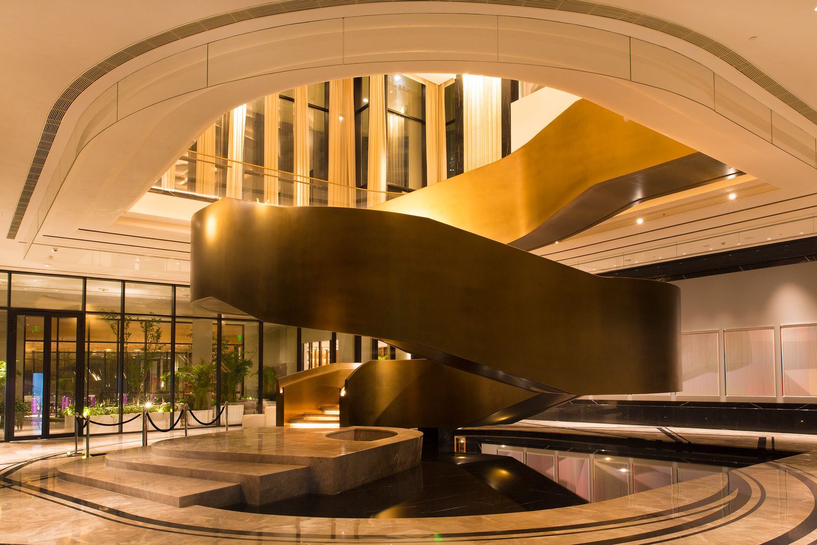
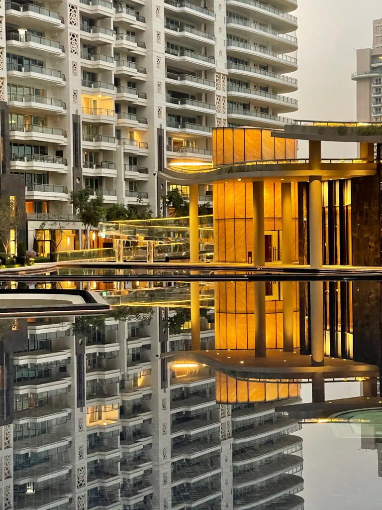
DLF's identity operates on restraint. Where most developers scream luxury with gold gradients and cursive scripts, DLF whispers it—limestone whites, shadow charcoals, and editorial serifs that command without shouting. Every choice signals permanence.
Their visual system scales beautifully from ultra-luxury penthouses in Camellias to mid-segment towers in New Town Heights. The typography adjusts in weight and scale, but the DNA remains identical. This is what great brand architecture looks like—a system flexible enough to contain contradiction without breaking.
What fascinates us most: DLF treats negative space the way their architects treat lobbies—as a luxury in itself. The emptiness on their collateral is not a design choice. It is a statement about what they can afford to leave unsaid.

Key Takeaways
What DLF teaches about building a brand that outlasts you.
Restraint is the ultimate luxury. When your product costs crores, the design shouldn't try to justify the price. It should assume it.
Materiality translates. DLF's colour palette isn't abstract—it's drawn directly from their buildings. Limestone, brass, shadow. The digital presence inherits the physical one.
Scale demands a system. 26 active projects under one visual identity, and none of them feel like templates. That's the power of a modular typographic system over a rigid brand guideline.
"The best architecture disappears. It becomes the backdrop against which life happens. The best brand identity does the same."
— Our observation